There are styles in decor that manage to transcend time, and the monochrome style is exactly that kind of approach! By combining different shades of the same color, this style offers both simplicity and sophistication, instantly bringing order, cohesion, and calmness to your home or office. In this article, we will start by answering the question, “What is monochrome?” We will explain why you should choose this style, which monochromatic colors stand out, and most importantly, how you can apply it step by step in your own spaces. With the examples we provide, you’ll be able to capture the timeless elegance of monochrome decor.
What Is Monochrome?
Monochrome literally means “single color.” In the context of decor, monochrome refers to a design approach that uses different shades, light-dark levels, and textures of the same color together. The main purpose is to reveal the full richness of that color, achieve harmony among its tones, and add depth to the space.
For example, imagine a gray monochrome decor: light gray walls, anthracite sofas, and metallic accessories come together to create a look that is both simple and truly striking. The monochrome style, with its clean design, hints at minimalism, while the variety in color tones prevents it from ever being boring, instead adding a sophisticated and modern feel. This is why this style is frequently preferred in both homes and offices. The main reason monochromatic colors are so loved is that they provide a rich atmosphere without creating visual clutter.
Why Choose a Monochrome Theme?
The monochrome style stands out not only for its aesthetics but also for its functional advantages. This style brings order, cohesion, and timeless elegance to a space.
Main reasons to choose monochrome:
-
Combining different shades of the same color reduces visual clutter, making the space look more organized.
-
It is independent of trends. Even as years pass, monochrome decor retains its modern appeal.
-
Monochrome is a powerful way to harmonize different furniture and accessories.
-
Using different shades of a single color creates layers and adds depth to a space.
-
In offices, the monochrome style conveys a sense of professionalism and modernity.
How to Create a Monochromatic Color Palette
The foundation of monochrome decor is creating a palette that harmonizes with the chosen color. This palette can be enhanced with light and dark shades and different textures to add depth.
Steps to create a monochromatic color palette:
-
Choose the Main Color: First, select the dominant color for the space. Neutral colors like gray, white, beige, or black are the most common choices. However, blues, greens, and earthy tones can also form monochromatic palettes.
-
Use Tone Variations: Evenly distribute light, medium, and dark shades of the color. This prevents the space from looking monotonous.
-
Utilize Textures: Materials like fabric, wood, metal, and glass make the shades appear more lively and rich.
-
Add Slight Contrast: While monochrome is based on one color, light-dark contrasts bring the palette to life. For example, gray furniture on a white floor makes a strong visual impact.
-
Consider Natural Light: Lighting affects how tones appear, so plan your color palette according to the natural light in the space.
Most Popular Monochromatic Colors and Their Effects
Many colors can be used in monochrome decor, but some stand out for being timeless and easy to apply in different spaces.
-
White: Evokes purity, cleanliness, and a sense of spaciousness. Using white tones in small spaces makes them appear larger and brighter.
-
Black: Adds strength, drama, and a modern feel. However, excessive use may make a space feel cramped, so balance is important.
-
Gray: The most popular color for monochrome decor. Offers a modern and neutral effect, harmonizing easily with all tones.
-
Beige and Earth Tones: Convey naturalness and warmth, creating a calm and inviting atmosphere in home decor.
-
Blue: When light and dark shades are combined, it creates a calming effect and enhances focus in offices.
-
Green: Represents nature and vitality. Light greens add freshness, while dark greens create depth.
Fundamental Principles and Application Tips for Monochrome Decor
Although monochrome decor is based on using different shades of a single color, some key principles and tips ensure a successful result.
Fundamental principles:
-
Light and dark shades should be distributed evenly; having all surfaces in one tone can appear monotonous.
-
Emphasize a specific area (like a seating or dining space) with darker shades to create a focal point.
-
Since tones are affected by light, plan windows and lighting carefully.
-
Different materials such as fabric, wood, metal, or stone enrich the shades of a single color.
Application tips:
-
In small spaces, use light tones on floors and darker shades on furniture to create contrast.
-
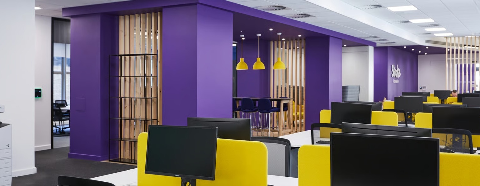
Neutral monochrome palettes like gray or blue create a modern and professional look in offices.
-
Floor coverings such as carpet tiles, woven vinyl rugs, or luxury vinyl tiles can add both texture and tonal contrast.
-
Select accessories (artwork, cushions, lighting) in different textures of the same color to reinforce the monochrome style.
Monochrome Decor Examples
Home Decor:
-
Living Room: White walls, gray sofas, and black metal details create a simple yet elegant look.
-
Bedroom: Using different shades of beige creates a peaceful and calming sleeping area. Light floors balanced with dark textiles enhance the effect.
-
Kitchen: A black-and-white monochrome combination offers a modern and timeless kitchen style.
Office Decor:
-
Workspace: A gray-dominated office conveys a professional identity. Carpet tiles or woven vinyl rugs can strengthen the monochrome theme.
-
Meeting Room: A monochrome design in navy tones enhances focus and creates a corporate atmosphere.
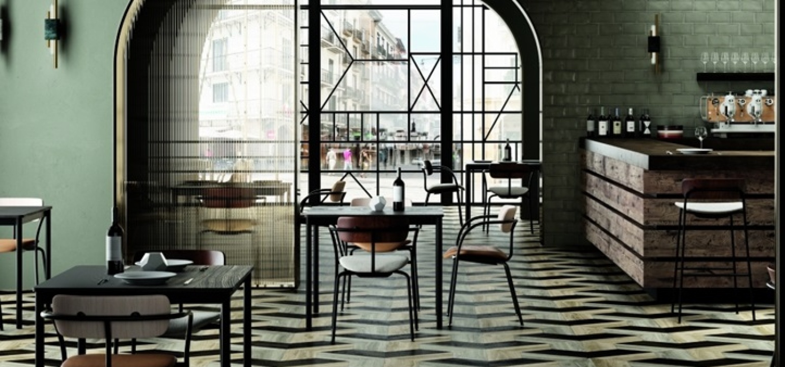
Commercial Spaces (Store, Cafe, Hotel):
-
Black-and-white monochrome themes in stores highlight the products.
-
Beige and brown tones in hotel lobbies create a warm and inviting first impression.